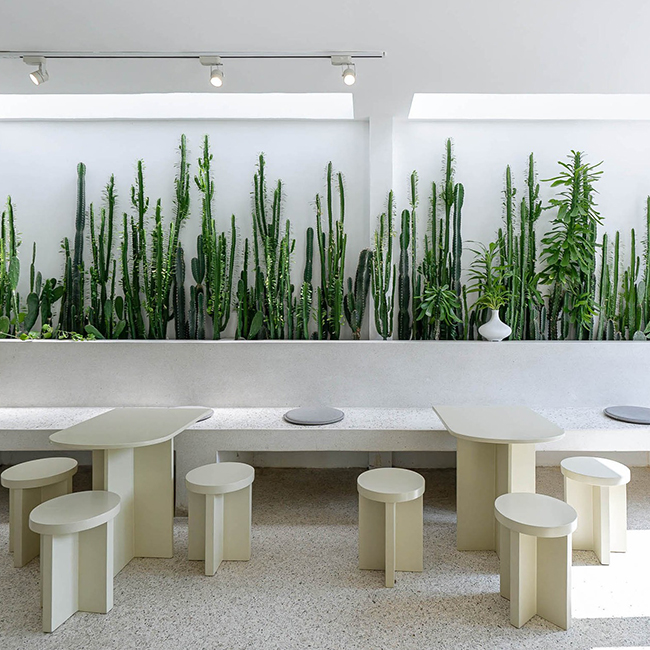
Pang Mei Noodle Bar by Office AIO
From bowls of noodles to grab-and-go desserts, Pang Mei Noodle Bar (“Pang Mei”...
SENSWE A Beautiful Space
In the early stage of brainstorming, It seemed very difficult for me to find a certain kind of...
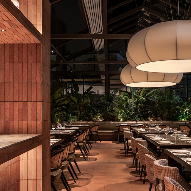
Terrakota Restaurant by MDO Shanghai
Terrakota, a European Bistro originating from the Mediterranean and the Atlantic.With a deep...
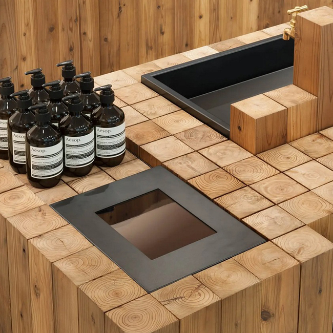
Aesop Store in Kichijoji by Schemata Architecs
In the bustling city of Tokyo, where modernity and tradition intersect, Aesop Kichijoji seamlessly...
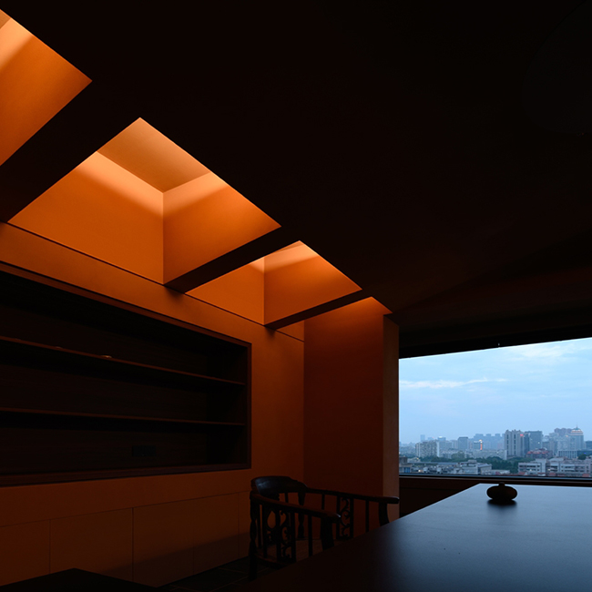
Barceló Torre de Madrid Hotel by Jaime Hayon
Spanish design superstar Jaime Hayon nods to his country's rich cultural heritage in new hometown...
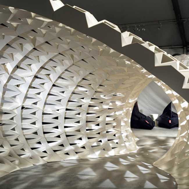
Emerge exhibition showcases Southeast Asian design at Singapore Design Week
Singapore Design Week exhibition Emerge has presented work ranging from handcraftto...

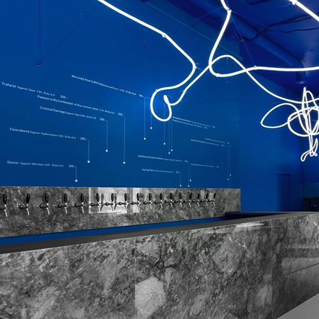
Galaxy Bar and Bottle Shop, Moscow
Far, far away from craft beer convention, Moscow's Galaxy Bar and Bottle Shop is full of...
Aesthetic Medicine Clinic Grožio Pasaulis
Clinic for aesthetic medicine and dermatology is situated in a busy part of Vilnius, neighboured...
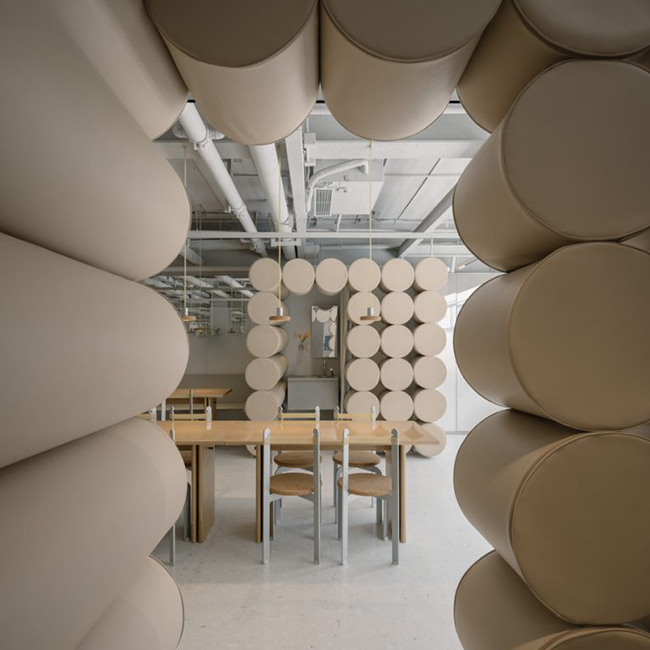
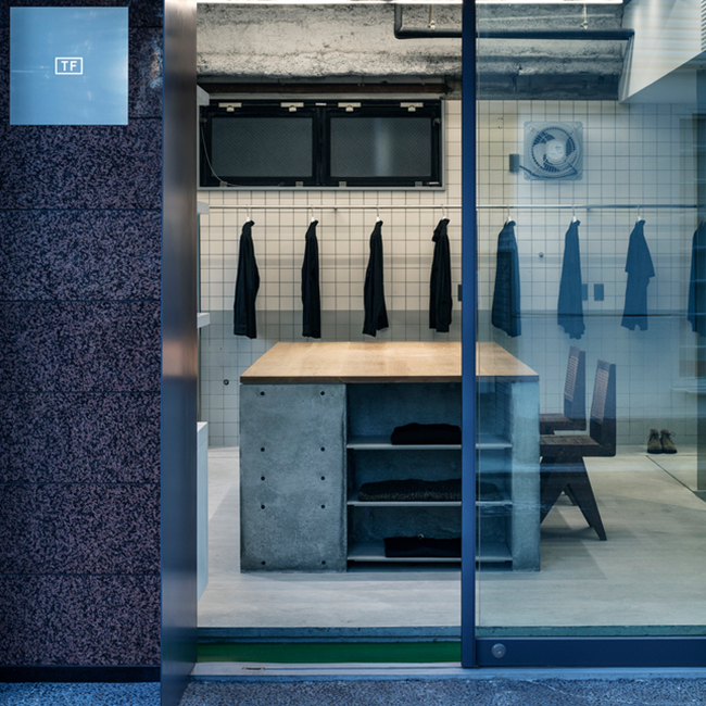
TF Store by Kenta Nagai Studio
TF is a well-known fashion boutique. Meaning of the shop name TF = ToFu (Japanese food). Their...
FXFOWLE Lounge installation by FXFOWLE Architects, Miami
FXFOWLE Architects shared with us their custom-design for the inaugural Miami Project art...
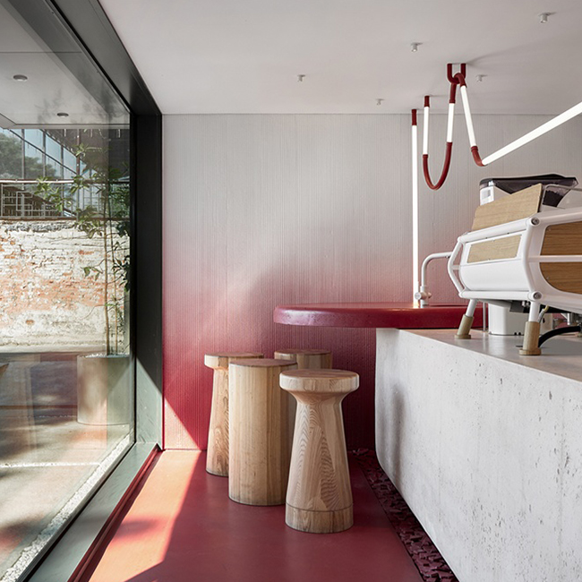
Tamago Kissaten café by DA bureau
Founded in 1255, Kaliningrad is one of the Baltic region‘s oldest cities with an eventful...
Café At Last
White "cafe" that becomes part of "home" perfectly. It meets lifestyle and regular lifestyle of...